


by NOVA

Sep 16, 2026
Compare the measurement type before you compare the number: a useful solar inverter efficiency comparison starts by asking which efficiency each percentage actually is, at which load points and DC voltage it was taken, and which losses sit entirely outside it. Two offers can print figures a fraction of a point apart and still behave differently on the same roof, because one figure was recorded at a single favourable moment and the other was averaged across a working day. What follows separates the measurements that exist, shows how the two regional weightings score identical hardware differently, names the losses no percentage carries, and sets out what to ask for when a supplier publishes no percentage at all.
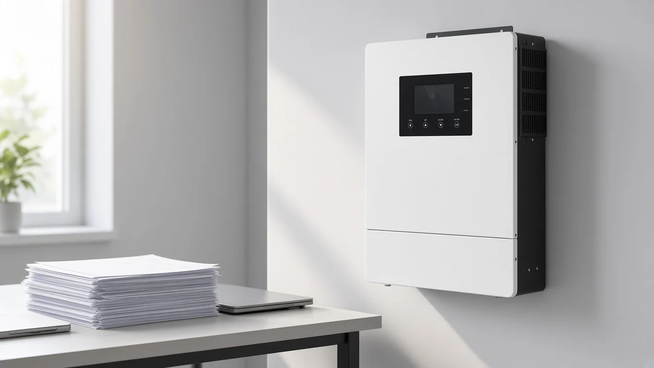
It settles which measurement you are holding, not which brand is better. Efficiency arrives on a datasheet as a small family of unrelated figures, and a buyer who ranks two offers by whichever number is larger is often comparing a best-case reading against a working average.
Sales conversations collapse all of them into one word. The five rows below are the ones worth separating before any price discussion, because each answers a different question and none substitutes for another.
| Figure on the datasheet | What it measures | What it cannot tell you |
|---|---|---|
| Peak or maximum efficiency | The best conversion ratio recorded at one favourable operating point | How the unit behaves on a dull morning or a heavily loaded afternoon |
| Weighted efficiency | A load-averaged conversion ratio built from measurements at several fractions of rated output | Which load points dominated the average, unless the weighting is named |
| Part-load efficiency | The individual readings at low, medium and high output that feed the average | Annual yield, on its own |
| Efficiency curve | The whole shape, ideally measured at more than one DC input voltage | Anything about standby draw or thermal behaviour |
| MPPT tracking efficiency | How closely the controller holds the array at its true maximum power point | Anything about DC-to-AC conversion |
The headline percentage on a datasheet is usually a peak figure taken at one favourable operating point, and trade coverage of the test protocol notes that a unit may sit there for only about an hour a day. That single sentence is enough to retire the habit of ranking offers by the largest printed number.
The load-averaged figure belongs in the quote, because it is the only one built to describe a working day rather than a favourable instant. Modelling guidance written for yield software makes the same choice, treating a weighted value as a better representation of behaviour across output levels than any single operating point.
There is a second reason to prefer it, and it is commercial rather than technical. A peak reading often originates inside the vendor’s own laboratory, whereas the weighted figures that appear on regional equipment lists came out of a published protocol requiring measurement by an independent testing house across the operating power range and at more than one DC input voltage.
Owners regularly find metered output well below the weighted percentage they were sold, and the practitioners who answer them point at array geometry, summer heat, per-optimizer loss and wiring runs before they blame the converter. That gap is worth naming in advance with a customer, because a percentage describes one box and a meter reading describes an entire installation.
Important: inverter weighted efficiency is an average, not a floor — a unit can post a strong weighted figure and still sit in its worst region for most of a winter morning, which is exactly when a low-irradiance site earns the least.
Because the two formulas put their heaviest factor on different load points, identical hardware scores differently depending on which one a datasheet quotes. Neither is a grade or a certification — each is a set of multipliers applied to the same underlying part-load readings, chosen to resemble a particular region’s operating pattern.
The two published factor sets sit side by side below. The pattern to notice is where the weight concentrates, and which formula bothers to measure a very small load at all.
| Load point as a fraction of rating | CEC factor | European factor |
|---|---|---|
| 5% | not measured | 0.03 |
| 10% | 0.04 | 0.06 |
| 20% | 0.05 | 0.13 |
| 30% | 0.12 | 0.10 |
| 50% | 0.21 | 0.48 |
| 75% | 0.53 | not measured |
| 100% | 0.05 | 0.20 |
The two published formulas differ mainly in where they put their heaviest factor: the CEC set leans on the three-quarter-load point, while the European set leans on the half-load point and is the only one of the two that measures a very low load at all. So a datasheet prepared for a sunnier market and one prepared for a cloudier market can describe the same converter and still disagree, and the disagreement is arithmetic rather than marketing.
Two limits are worth carrying into a negotiation. A national-laboratory review of how those factors were derived reports that moving an existing CEC weighted value between a lower-irradiance and a higher-irradiance climate typically shifts it by less than 0.05%. The same review concludes that once a large array sits behind each inverter, the weighting piles onto the full-power point and stops separating one unit from another, and it points buyers to the rated-power figure plus a site production simulation instead.
Match the evidence to the loading and irradiance pattern the units will really see, because the same figure carries different weight on a cabin, a cloudy rooftop portfolio and a heavily loaded commercial array. The matrix below turns each profile into the one piece of evidence worth insisting on.
| Project profile | Evidence worth insisting on | Why this profile changes the answer | Where a headline figure misleads |
|---|---|---|---|
| Off-grid cabin or small hybrid site, long low-load hours | Continuous standby draw, plus part-load readings at the bottom of the range | Overnight and shoulder hours dominate the energy budget | A strong mid-load average hides a heavy overnight draw |
| Cloudy or northern rooftop portfolio | European weighted efficiency, or the low-load part of the curve | Half load and below is where most of the year is spent | A figure prepared for a sunny market flatters the unit |
| Sunny rooftop or ground-mount, moderate loading | CEC weighted efficiency at the project’s DC voltage | Three-quarter load carries the average | A peak reading says nothing about the working band |
| Heavily loaded array behind each inverter, meaning a high DC-to-AC ratio | Efficiency measured at rated power, plus a site production simulation | Weighting collapses onto the full-power point | Any weighted figure stops discriminating between units |
| Shaded, split or partially obstructed array | Tracking behaviour and tracker count, then conversion efficiency | Finding the operating point matters more than the last fraction of conversion | A conversion percentage implies a yield it cannot deliver |
| Cross-region tender with mixed datasheets | Both weighted figures, or the raw part-load table | Offers are otherwise being scored on different formulas | Comparing one region’s figure with another’s is meaningless |
Independent precision measurement of one microinverter population found the leaders within about a point of each other and a long tail several points lower, with one unit collapsing when pushed toward its upper rating. Genuine spread exists inside a single product class, which is the case for asking rather than assuming.
They are measured separately and can fail independently, so a strong figure in one column tells you nothing about the other. MPPT tracking efficiency describes how closely the controller finds and holds the array’s maximum power point as light changes; conversion efficiency describes what happens to that power once it has been captured.
Tracking figures printed near the top of a specification sheet tend to sit very close to each other, which makes them look settled. Behaviour at the bottom of the input range is where they separate, and that is rarely published.
In one published bench series the tracker stopped holding a stable operating voltage below roughly 2 A of input current, and the measured conversion ratio at the lowest inputs sat far below the same unit’s figure at higher current. On a shaded or low-irradiance site, that behaviour costs more than the last fraction of a conversion point.
A published residential hybrid datasheet keeps tracking efficiency, paired European and maximum conversion efficiency, battery-to-load efficiency, tracker count, operating temperature range and an altitude derating threshold in separate fields. That layout is a reasonable template for what to ask a supplier to fill in.
Continuous draw sits outside every conversion percentage, which is why an off-grid energy budget can fail on a unit with an excellent weighted figure. Standby self-consumption is the draw the unit takes to sit awake producing a waveform at no load, and conversion loss stacks on top of that whenever power actually flows.
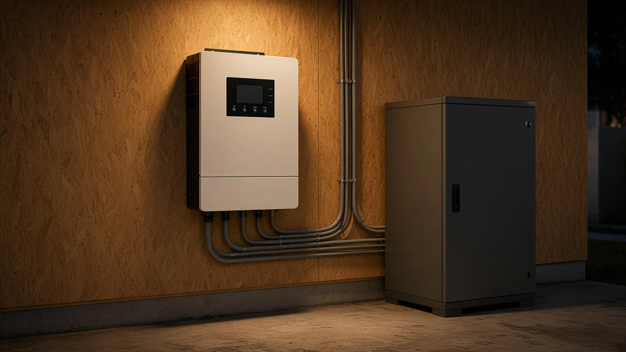
Two units of similar rating can differ sharply on that continuous figure. One practitioner comparing all-in-one hybrids reported a 12 kW unit drawing fifty to eighty watts around the clock while a competing unit in the same class drew thirty-five. Over a night with no production, that gap matters on a battery bank sized for a cabin.
The same threads carry a more useful complaint than any number: the curve is missing. Practitioners say plainly that because efficiency curves go unpublished, they cannot know behaviour at the wattage their site actually runs at, and so cannot compare candidates honestly.
From the field: the number that decides an off-grid quote is often the one nobody prints — ask for continuous draw at no load and for two part-load readings near the site’s real operating band, and treat the answer as part of the electrical envelope rather than a footnote.
A percentage without its measurement conditions is an incomplete comparison, because both temperature and DC input voltage move the result. A full curve dataset is normally recorded at several input voltages and at a series of power levels from a small fraction of rating up to full output, which is what makes two offers strictly comparable.
When only a maximum and a weighted figure are printed, the DC voltage those measurements belong to is usually left unstated. The safest reading is that they belong to whichever voltage flattered the unit most, which means a project sitting at the bottom of the DC voltage window may never see them.
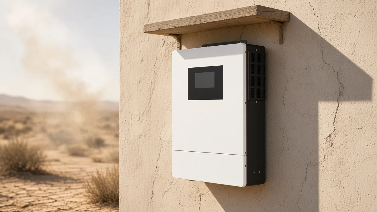
Temperature acts twice. Conversion drifts downward as internal temperature rises, and separately temperature derating reduces output deliberately once a programmed thermal threshold is passed. An enclosure baking on a south wall, an unventilated plant room and a shaded cabinet therefore deliver different energy from identical hardware.
Ask for the measurement type, the load points, the voltages and the continuous draw, and ask in the same message so the answers arrive together. The table below is short deliberately: each row exists because a real comparison fails without it.
| Field to request | Why it changes the comparison | Acceptable answer | Warning sign |
|---|---|---|---|
| Which efficiency each quoted figure is | Peak and weighted describe different events | Each percentage labelled peak, weighted or tracking | One unlabelled percentage |
| Which weighting was applied | The two formulas favour different load points | The weighting named, or both figures given | A weighted figure with no formula stated |
| Part-load readings across the range | The average hides the shape | A table of readings from low load to full output | Only an average |
| DC voltage each reading was taken at | Results move with input voltage | Readings at more than one voltage, including the project’s band | A single unattributed figure |
| Who performed the measurement | A vendor bench and an independent house are different evidence | A named independent testing house | Internal testing described as certified |
| Continuous draw at no load | It sits outside every conversion percentage | A stated figure, ideally with charge-controller draw separated | Silence, or a single combined number |
| Thermal derating threshold and ambient range | Output falls before it fails | A stated onset temperature and operating range | A single ambient rating with no derating note |
| Tracking behaviour at low input | Finding the operating point precedes converting it | A stated minimum input, plus low-end readings | Only a headline tracking percentage |
Keep this separate from the arithmetic of choosing a size, which the inverter sizing checklist covers, and from the architecture decision handled in the on-grid and off-grid comparison. Efficiency evidence is worth requesting only once the class and rating are already settled — and if a hybrid is on the table, the trade-offs in hybrid inverter drawbacks belong in the same conversation.
For an off-grid or battery-backed brief in the solar inverter range, the combined inverter-charger in the hybrid inverter family is the practical starting point, and its published electrical envelope is specific enough to check a project against.
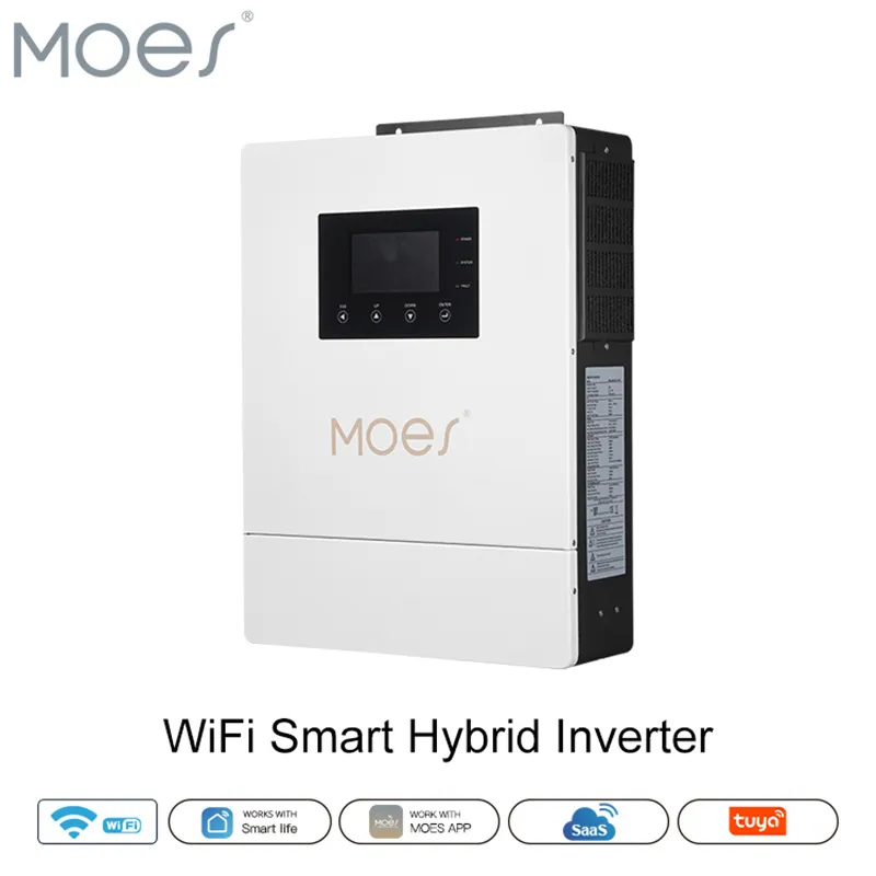
Everything quoted here comes from that listing’s own parameter table. The MOES WiFi Smart Hybrid Solar Inverter listing states a 48V DC operating voltage, a 60V-450V tracking window and a built-in solar controller rated 80A/100A. Its stated output envelope is single-phase 176-253V at 50Hz/60Hz across a 4.2KW/6.2KW power range, with pure sine wave output, WiFi monitoring and operation without a battery.
| Page-stated parameter | Hybrid inverter-charger listing | Pure sine wave listing |
|---|---|---|
| Category path | Solar Inverter, Hybrid Inverter | Solar Inverter, Off Grid Inverter, Pure Sine Wave |
| DC operating voltage | 48V | 12V/24V/48Vdc |
| AC side | single phase 176-253V | 110V/120V/220V/240Vac |
| Frequency | 50Hz/60Hz | 50Hz/60Hz |
| Power range | 4.2KW/6.2KW | 300W~6000W |
| Built-in solar controller | MPPT 80A/100A, 60V-450V | not stated |
| Battery charging | yes, AC and DC control | not stated |
| Efficiency percentage published | none | none |
Where the brief is a plain DC-to-AC duty with no solar input or battery charging, the adjacent pure sine wave listing states 12V/24V/48Vdc input and a 300W~6000W power range without a charger function. Both sit under the wider off-grid inverter family.
Two honest limits belong with the recommendation. Neither live MOES inverter listing prints an efficiency percentage of any kind, so there is nothing on the page to compare and the figure has to be requested. And where a tender needs a weighted percentage or a curve as a contractual input, that evidence has to come through the enquiry before the offer is scored — talk to the MOES team with the field list above attached rather than a single question about efficiency.
Rarely on its own, but it has one real use. When a large array sits behind each inverter and the units spend long periods near full output, the weighted average stops discriminating and the figure measured at rated power becomes the more informative reading. Outside that loading pattern, treat a peak figure as context rather than a ranking criterion.
Because the percentage describes one box and the meter describes the whole installation. Split array orientations, summer heat, module mismatch, per-optimizer conversion loss, home-run cable loss and where the enclosure is mounted all sit between the array and the meter. A datasheet figure is an upper reference for one component, so a lower system reading is normal rather than evidence of a defect.
Roughly speaking, one more point of conversion delivers close to one percent more energy, which compounds over a twenty-year operating life. Whether it is decisive is another matter — clipping, downtime, mismatch and service response can easily swamp the difference. Treat it as a genuine but secondary lever once availability and support are settled.
Ask for whichever matches the site’s irradiance pattern, and ask for both when a tender mixes suppliers from different regions. Modelling guidance points to CEC weighted efficiency for sunny locations and the European figure for less sunny ones. If only one is offered, the underlying part-load table is a better request than an argument about formulas.
Less than it appears to. Published tracking figures cluster tightly and are usually taken under steady laboratory light, so they separate candidates poorly. The informative questions are the minimum input at which tracking still holds, how many independent trackers the unit has, and how it behaves under fast-changing irradiance.
No. Self-consumption is what the unit draws to stay awake and produce an output waveform with no load attached; conversion loss is what disappears in the act of converting power and rises and falls with load. They add together, and on an off-grid site the standby figure often decides the battery sizing while the conversion figure decides the daytime harvest.
Only as a starting point, because architecture changes what the number means. Module-level equipment recovers energy from mismatch and shading that a string unit loses, while adding a conversion stage of its own. Compare the weighted figures to understand the hardware, then compare modelled yield for the actual array to understand the project.
Treat the absence as a data request rather than a red flag, and never fill the gap with an assumed figure. Send the field list — measurement type, weighting, part-load readings, DC voltages, testing house, standby draw, derating onset — and score the reply. A supplier who returns a part-load table at two voltages has given you more than a competitor who prints one flattering percentage.


OTHER SMART DEVICES
Jun 13,2026
OTHER SMART DEVICES
Jun 12,2026
TUYA SMART HOME PRODUCTS
Jun 12,2026
 +86 137 3639 3028